How we’re engaging students in real-time collaborative learning
By last autumn, it was looking like online learning in some form or other would be here to stay – so we decided to develop an innovative, “stand out” digital learning experience which went beyond students’ expectations of day to day online learning activities. The aim was to foster a high level of engagement with and between students studying the course; then to evaluate the development process and student feedback, with a view to informing future investment in digital learning within the University of Exeter Business School. Beyond this, we wanted to evaluate the investment in digital learning support, in our ongoing transition towards a blended learning environment.
Why Mural?
The selected project tool was Mural, for which the Business School holds a group licence. We chose Mural as our platform because it allows users to participate in real-time, acting as an online whiteboard where students contribute their ideas using text, sticky notes, connecting arrows and even drawings. It was compatible with all of the different multimedia we intended on using – enabling us to add videos, images and links throughout “the board”.
We wanted to create a gamified ‘board game’ feeling where, pedagogically, by zooming out on the Mural board, it would be possible to see the whole ‘journey’ the students were going to undertake. Consequently, they would better understand the interrelationships between the various sub-exercises and elements.
What we built
The storyboard for our exercise was an agile digital design ‘sprint’: a group activity where students come together in groups to design a new digital service, ‘pulling through’ relevant themes and learnings from the lectures. Accordingly, the exercise is structured into a series of timeboxed activities in which students can find all of the instruction and materials required already built into the digital environment. A key benefit to using Mural is its ‘outline’ feature, which helps students easily navigate through the different activities, adding to the gamified experience.
We’ve included a series of screenshots below to explain how the exercise works.
Overview of the Mural Board
The overall design is intended to feel like a traditional board game: that is, an environment where ‘players’ can see the overall logic that frames their activities, and thus make sense of each individual activity therein. The plenary board is where all of the activities will be introduced, before students complete the activities within breakout groups on a separate Mural board. To add to the gamified experience, we have added hyperlinked buttons that will take students between the two boards, to make it easier to navigate between them. Accordingly, our plenary board looks like this:
Key Steps
The board has been divided into four sections:
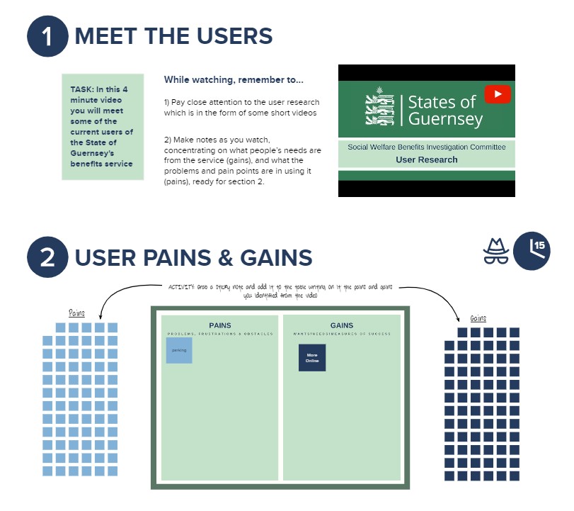
- (1) an introduction/outline to the session
- (2) User Needs
- (3) Service Design
- (4) Digital Infrastructure
…with each section introducing activities for students to complete in their breakout groups. The only exceptions to this are where we have inserted YouTube videos for students to watch as a class, and the “User Pains and Gains” activity.
Activities
1. Create a persona board
The first activity in the breakout sessions is to create a persona board. We have provided students with prompts, instructions, and tools they need to put the board together and therefore it is a simple drag and drop activity. Students will also have to replace existing text.
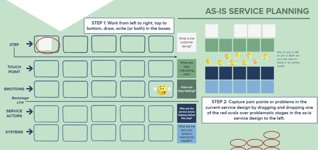
2. As-is service planning
The second activity will be partly demonstrated on the plenary board (see Point 5), before students complete it themselves in groups. Like above, we have provided steps to follow, as well as labels for students to drag and drop in the appropriate place.
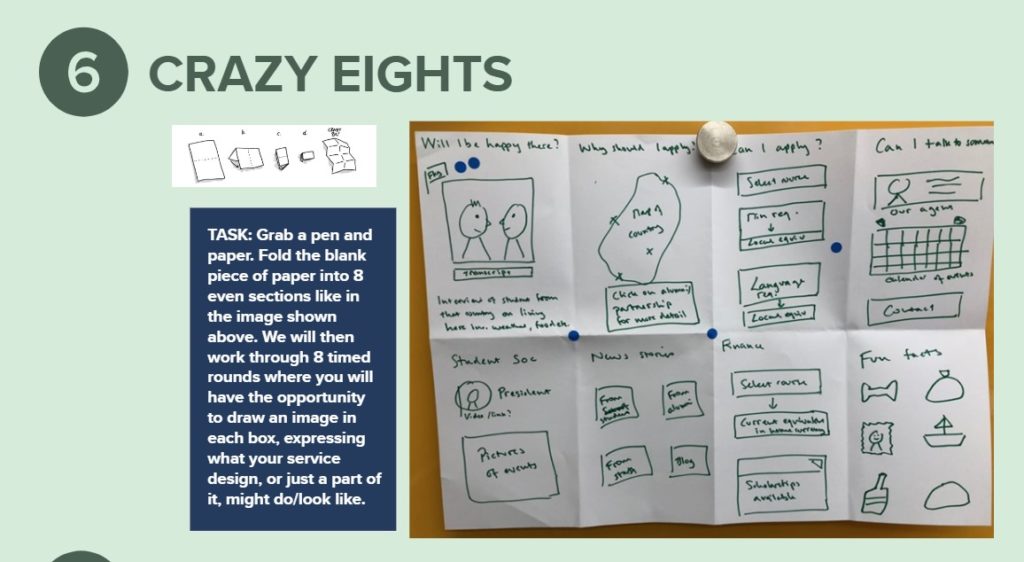
3. Crazy 8s
It was important for us that we use different media to keep the session dynamic. Therefore we included Crazy 8s, where students use pen and paper to quickly note their ideas. We have left a blank space in the breakout room for students to upload their drawings.
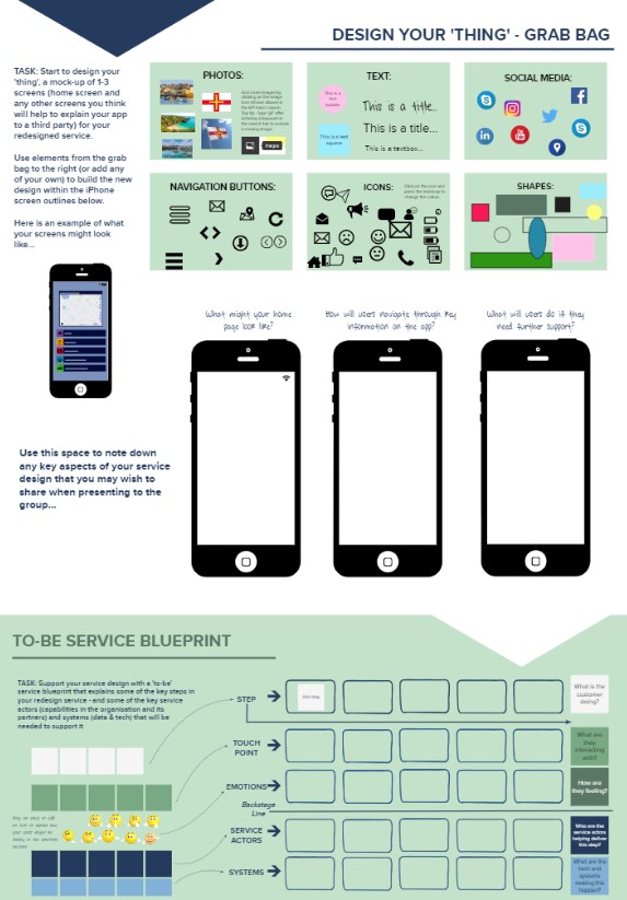
4. Design the ‘Thing’ and To-be Service Blueprint
Arguably one of the most creative activities, ‘Design the ‘Thing’’ asks students to mock-up a mobile app using different stickers, icons and text boxes. As before, we have provided a lot of guidance, as well as an example app, and a grab-bag full of different elements they may wish to include to make it realistic.
In the same breakout session, students will be asked to complete the ‘to-be service blueprint’, which is another simple drag and drop activity.
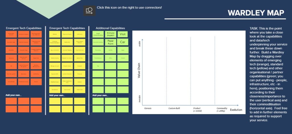
5. Wardley Map
The final Digital Infrastructure section contains the Wardley Map activity, which will be demonstrated firstly in the plenary session. Like all of the activities, we have provided sticky notes for students to drag and drop, but have attempted to make the activity even easier by inserting text into some of these sticky notes. Students will be simply selecting and dragging sticky notes from the left-hand side to populate the ‘board’ on the right.
What Happens Next
We will be trialling our Mural Design Sprint with our MBA Cohort in March, over a period of three days. We expect to learn a lot from this exercise: things that work well, that didn’t work, and also new ideas for future iterations. We hope that our students will appreciate the immersive nature of their experience, and that they will come away with a visceral sense of what it’s like to work in groups to design new digital services – even though the whole experience has been conducted online.


